Design Brief
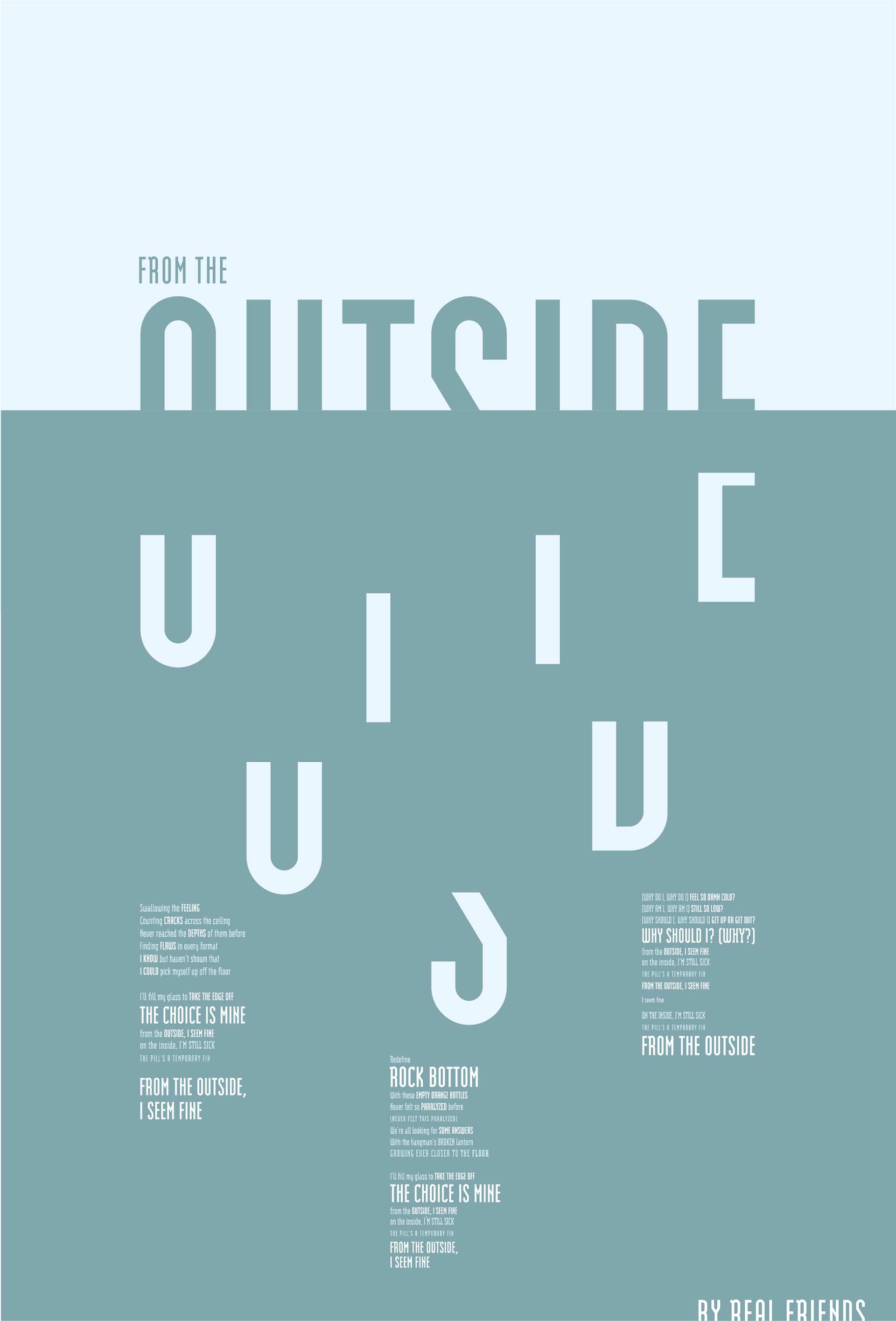
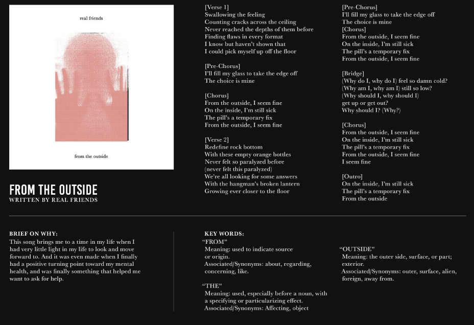
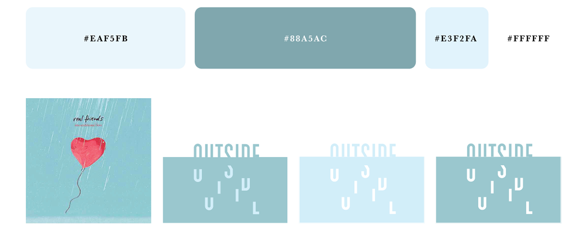
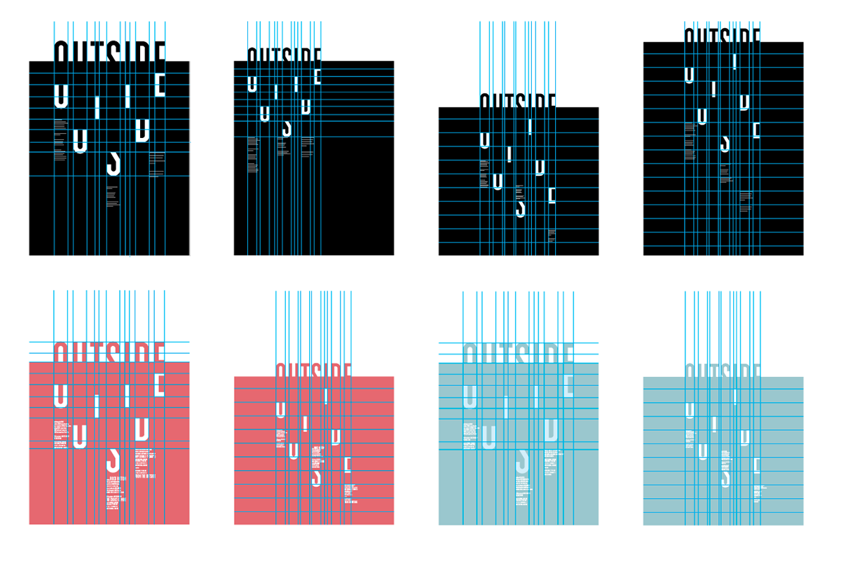
Goal for this project was to first create a logotype using inspiration and our personal perspective on a specific song that was selected. Then to choose a specific word or phrase that will be able to lend itself well enough in a visual form. Once the logotype was finalized a postmodern systematic grid was produced to create a layout for the lyrics of the song to harmoniously coexist with the logotype. Once the logotype and grid system were established, the color palette was decided through the inspiration of how the song conveys itself, as well as coming directly from the band's album art.
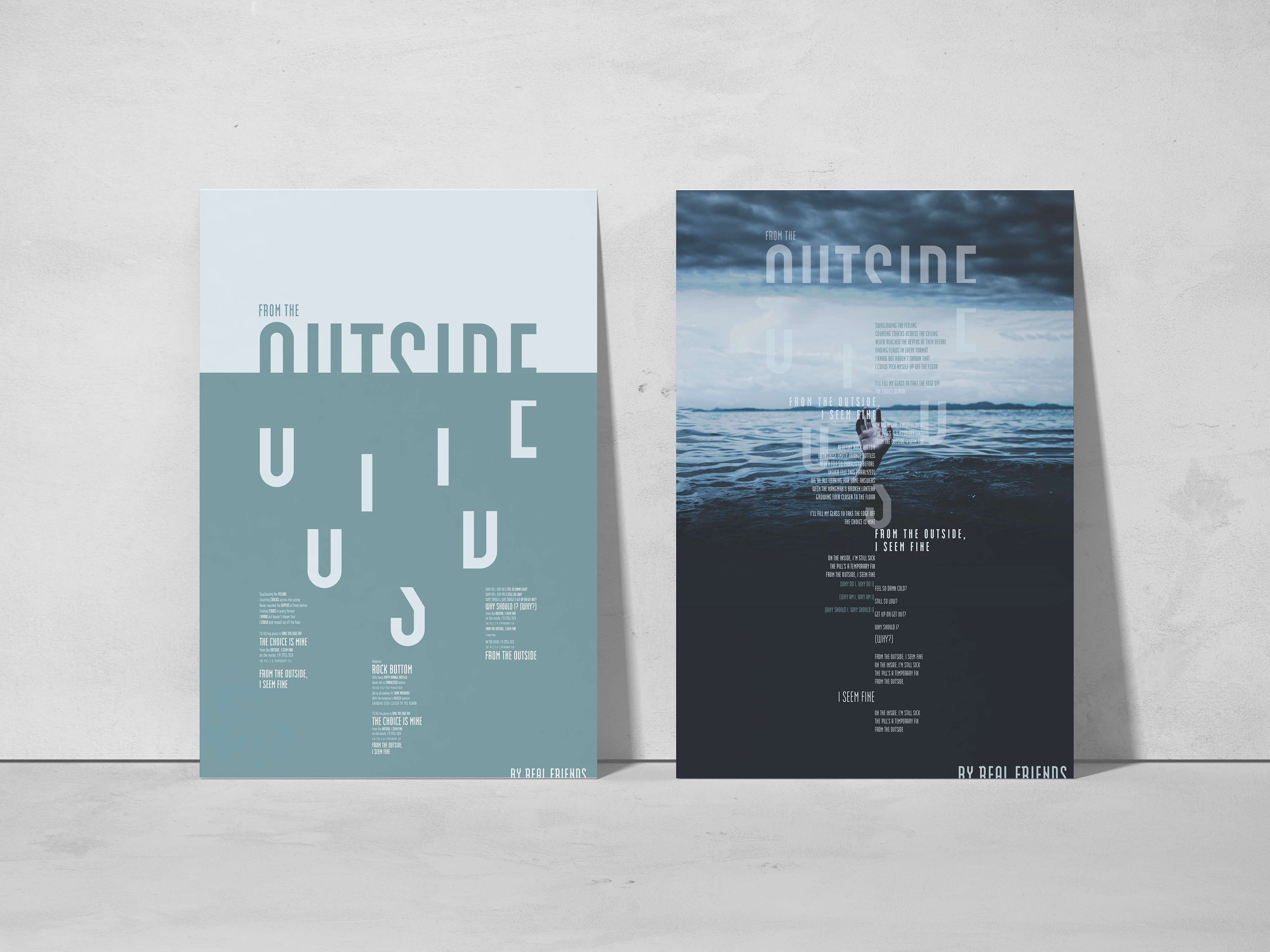
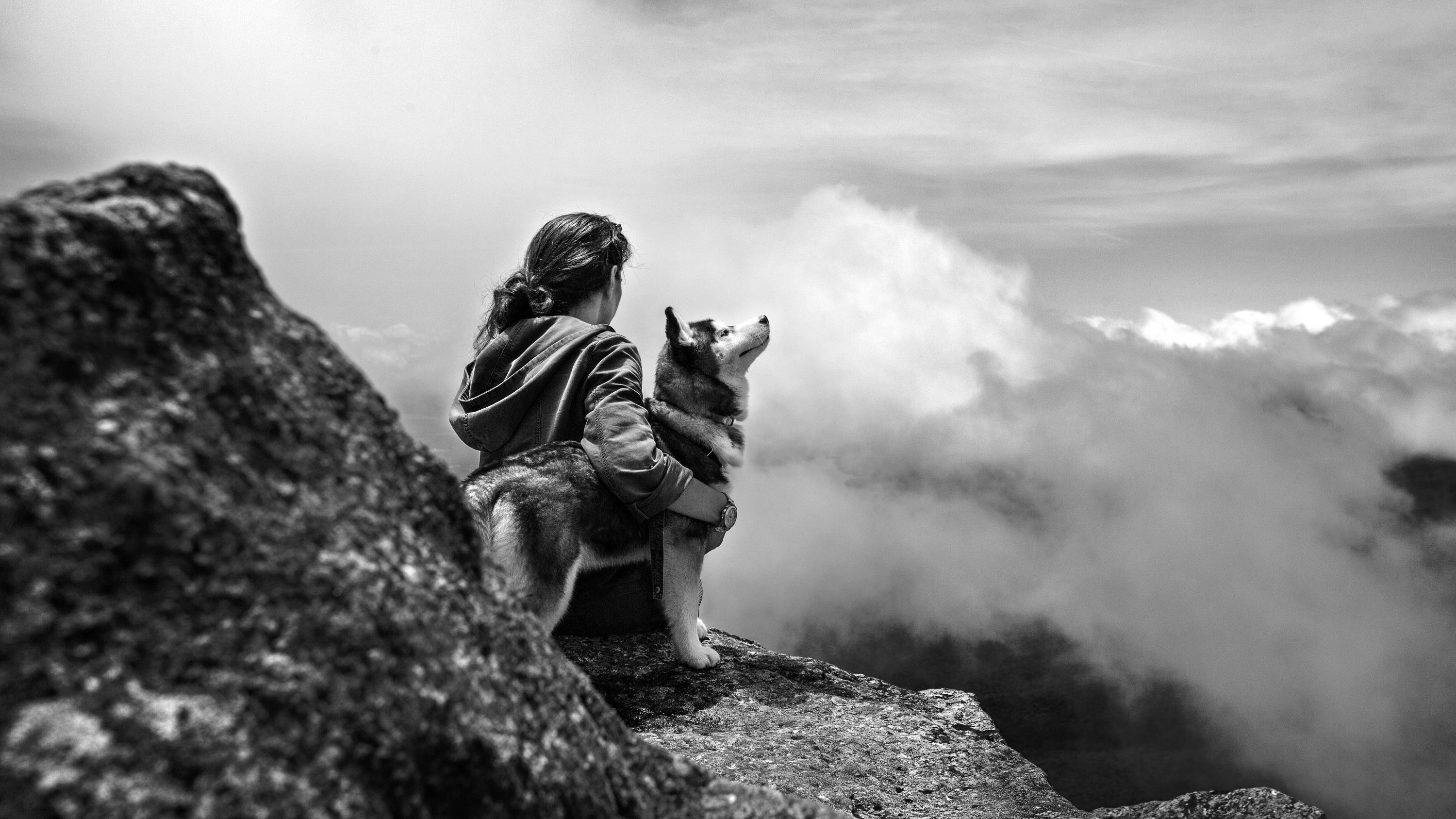
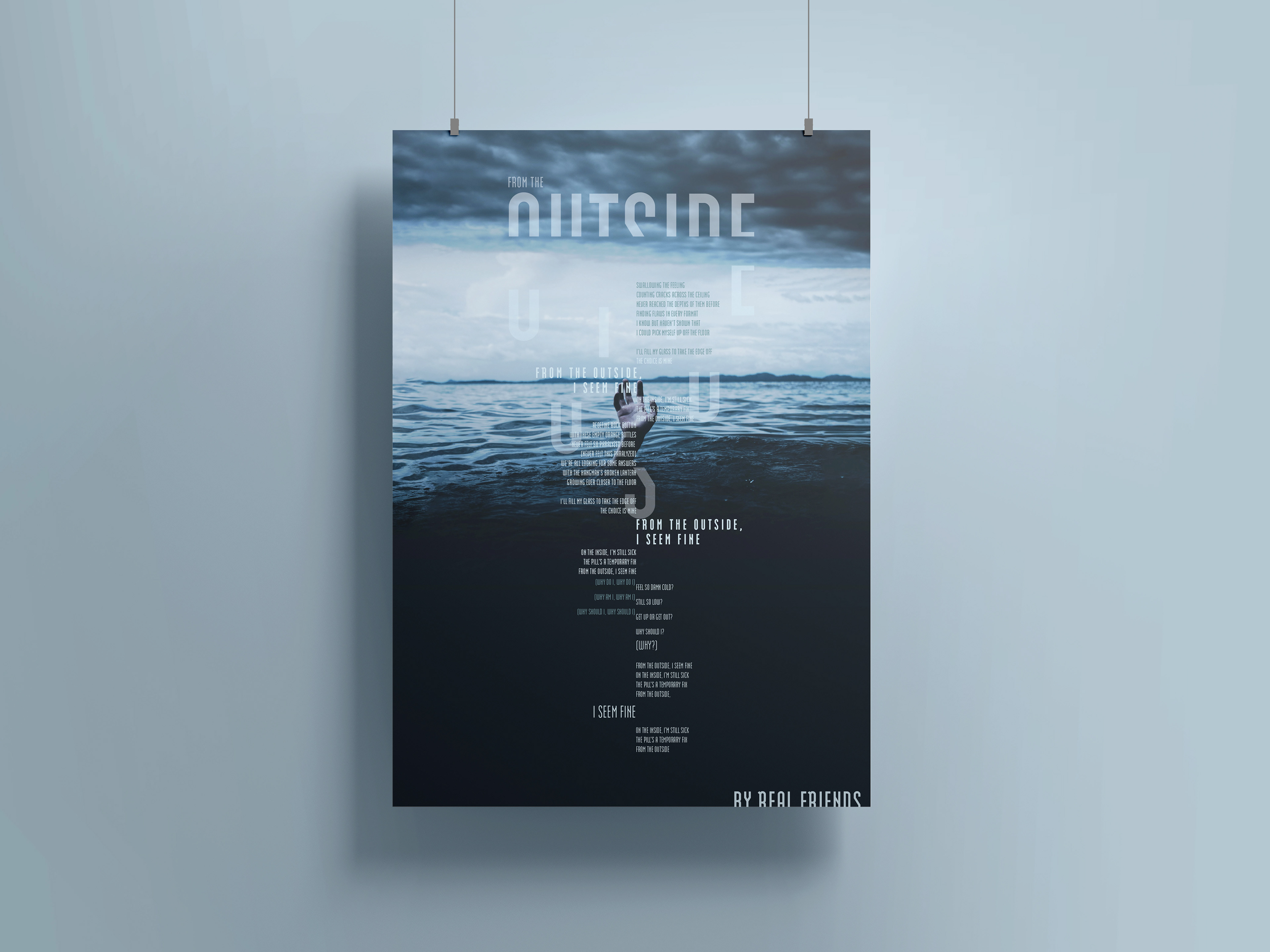
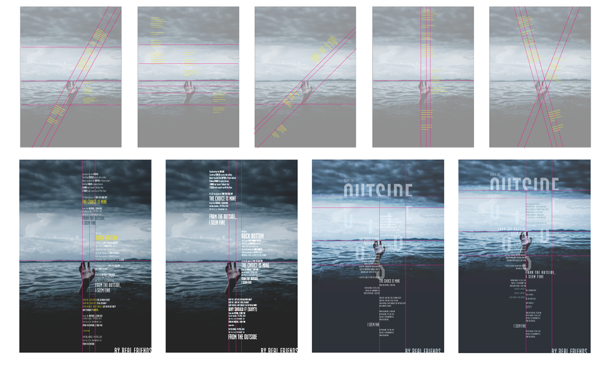
Second part to this project, was to create a secondary broadside where the logotype could be utilized or sustained, and to incorporate an image that has a clear visual representation of the song's meaning. A postmodern grid was then birthed from the contents of the image, along with the lyrics and prominent phrases being formatted into the flow of the song.
Design Process
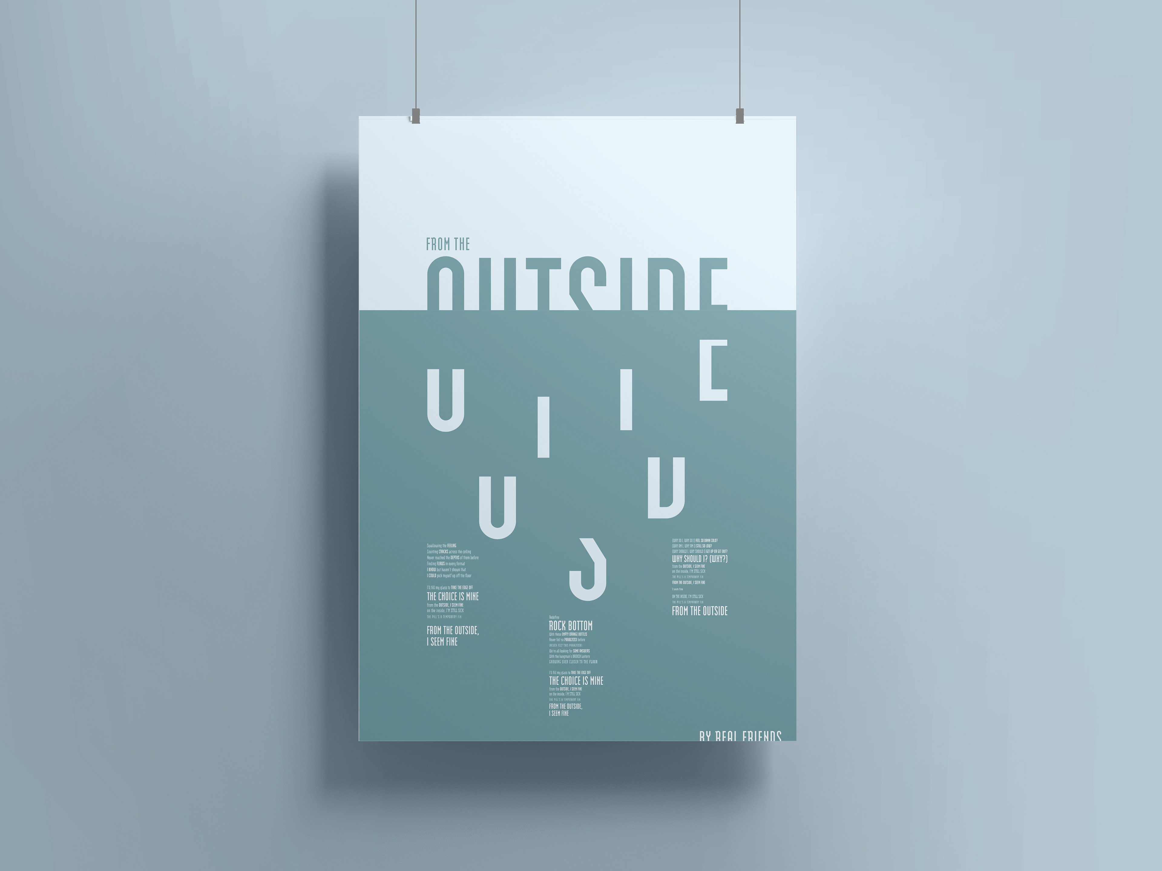
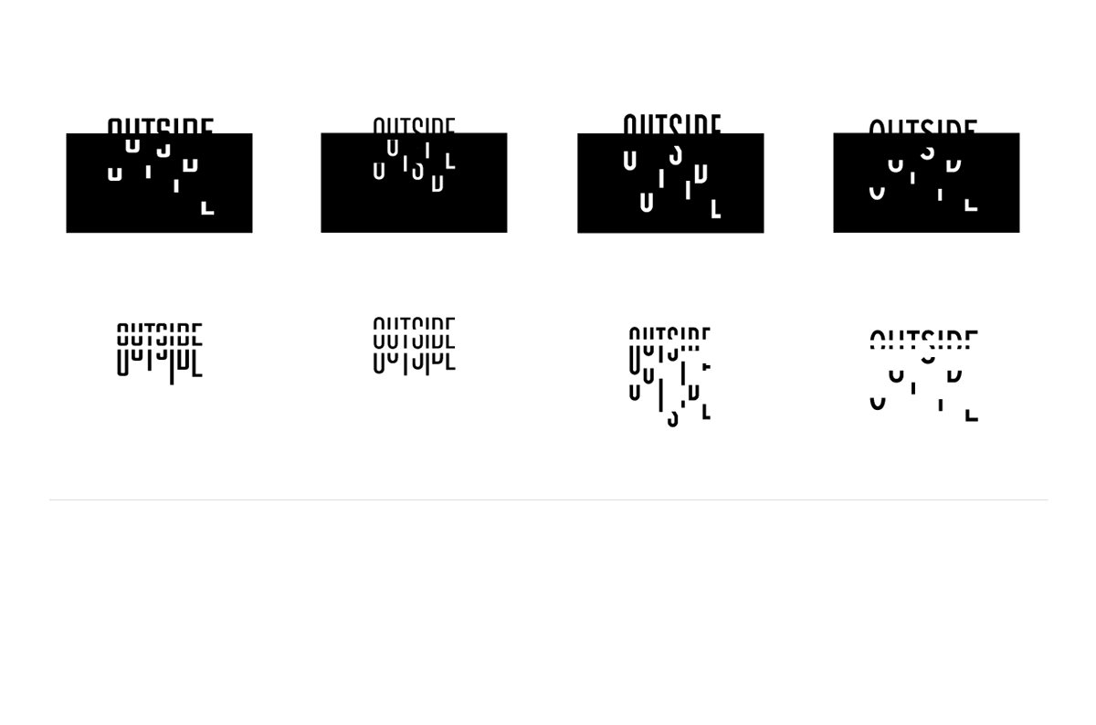
The first idea that came to mind when visualizing the logotype was having half of the type being visually structured and seemingly fine, while having the bottom half of the type broken and falling apart, almost conveying as though the pieces were drowning. This visual gave way to driving home the idea that mental illnesses can be overwhelming and have the feeling of drowning amongst themselves.
Which then inspired the color palette to develop into a blue monochromatic perception of the feeling of being in water and or falling deeper into a darker place. The approach to selecting the image for the second phase of the music broadside was obvious to unite the visual ideation that was conveyed with only type, to now find an image where a physical hand of someone was reaching out of the ocean. The two posters’ typography were treated completely different but ultimately easy to bridge the two seamlessly while also making them able to live on their own.
Which then inspired the color palette to develop into a blue monochromatic perception of the feeling of being in water and or falling deeper into a darker place. The approach to selecting the image for the second phase of the music broadside was obvious to unite the visual ideation that was conveyed with only type, to now find an image where a physical hand of someone was reaching out of the ocean. The two posters’ typography were treated completely different but ultimately easy to bridge the two seamlessly while also making them able to live on their own.
Research
When selecting the song to design this music broadside, the idea of combining the intention of designing for good and working with a song I knew well, went hand in hand. This specific song was written by the musical artist and lead singer of the band Real Friends, Dan Lambton. And through this song, and really almost all of the pop punk music that was created by this group, they have a focal topic of mental health and bringing awareness to the large age range of their audience, and to those audiences of other similar bands.
Logotype Sketches
Type Exploration
Color Palette
Postmodern Grid System Sketches
Part 2 of Music Broadside
Inter-grating type + image
Final Application